Are your metrics working?
This is the third in a series of posts on metrics. Check out Three Metrics Design Tips and Metrics and Workplace Culture for more! Evaluate qualitatively. Have team conversations about what's working and what's not working, and use that input to make tweaks. Discuss whether the activities being tracked seem to actually correlate to the hoped-for outcomes. For example, if you are tracking visits with donors with the idea that asks will follow visits, leading to dollars raised -- does this seem to be working? Make sure everybody is on the same page about definitions. And, make sure that reporting activities are reasonable -- balance the need for tracking institutional memory with the need to be in front of donors.
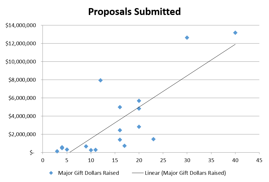
Use math. In addition to your qualitative evaluation, use a bit of math to see if your metrics are actually correlated with success. In theory, your leading indicator, for example prospect visits, should have a linear relationship with your hoped-for outcome, e.g. major gift dollars raised. So, when you plot the total number of visits by your development staff against the total dollars raised by each staff member, more visits should equate to more dollars raised. If it doesn't, then you've got an issue: your leading indicator is not actually correlated to your desired outcome, and it's time to troubleshoot.
I used linear regression to test three metrics for a nonprofit organization, and found that for this particular organization, number of asks was most highly correlated with major gift success (you don't ask, you don't get), followed by visits (not super-strongly correlated), and "moves" (not at all correlated). If you are a stats nerd, by all means, compute the R2 coefficient (closer to 1 = higher positive correlation) and p-values for your analysis, but if you are not, a few minutes creating a scatter plot in Excel will at least give you a rough sense of whether your metrics are doing what you want them to. Below are modified versions of the analysis I completed -- the trends are true, but the data is fake.
R2 = .02
R2 = .31 p-value = .0169
R2 = .61 p-value = .00013
Even without knowing the R2, it's pretty clear that one of these metrics is more effective than the others. If you find that some of your metrics aren't working, it's a good time to revisit definitions -- are we all on the same page with what a "move" is? And, if we are all on the same page, then what is going on that moves are not correlated with major gift outcomes? (This gets back to those qualitative discussions with the team.)
It could also be a great idea to test some potential alternative metrics to see if others are more useful. For example, is there a positive correlation between unique visits (counting each prospect visited one time to weed out "overcultivated" prospects) and major giving? It would also be intriguing to consider the future impact of discovery visits... that is, can we look at discovery visits 2 to 3 years ago and correlate that with today's major gift success? What about stewardship touches?
P.S. For anyone who was at my metrics session at yesterday's WVDO conference, thank you for your participation. From my (DayQuil-influenced) perspective, we had a great discussion and lots of good ideas were shared.
For more tips on designing your fundraising metrics, please check out Metrics: Set and Attain Goals for Fundraising Success, from Fundraising Nerd’s Make Your Donor Data Work webinar series.
Make your fundraising data management more awesome by subscribing to exclusive tips and updates, free downloads, and invitations from Fundraising Nerd. You’ll hear from us a few times each month, and we’ll never share your information.
And if you’d like to make sure you never miss a blog post, sign up here to receive an email each time we publish.


