Fundraising Nerd
Services Contact
Our Story Clients
Blog
About Our Story Clients Services Learn Blog Contact
Fundraising Nerd
Turn Your Data Into Donors

Sweet Chart, Dude

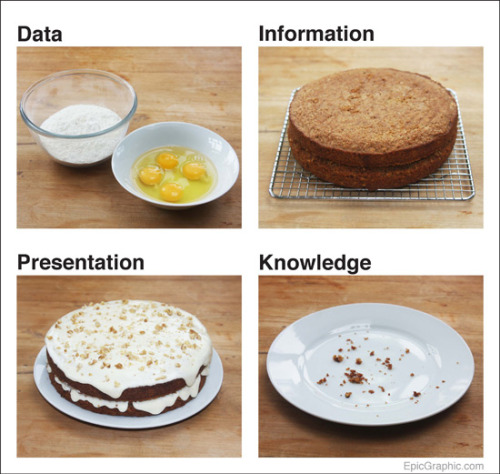
Thanks to hot tipper Brian F. in Portland for passing along this image from Epic.graphic by way of I Love Charts.

p.s. I can't believe it's been a month since I blogged! It's summer, and I've been busy fleeing a wildfire in Eastern Oregon. For real.

charts, data visualizationAmanda JarmanAugust 30, 20111 Comment
Facebook0 Twitter LinkedIn0 0 Likes
Previous

Live Blogging from Chicago

live-bloggingAmanda JarmanOctober 10, 2011
Next

Whew! APRA Wrap-Up

data visualizationAmanda JarmanJuly 30, 2011
Hours
 
logo - white.png